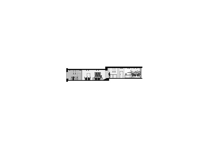
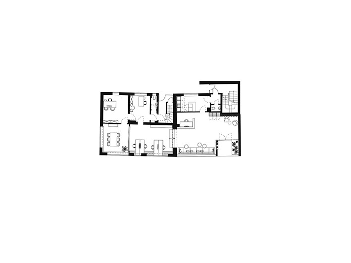
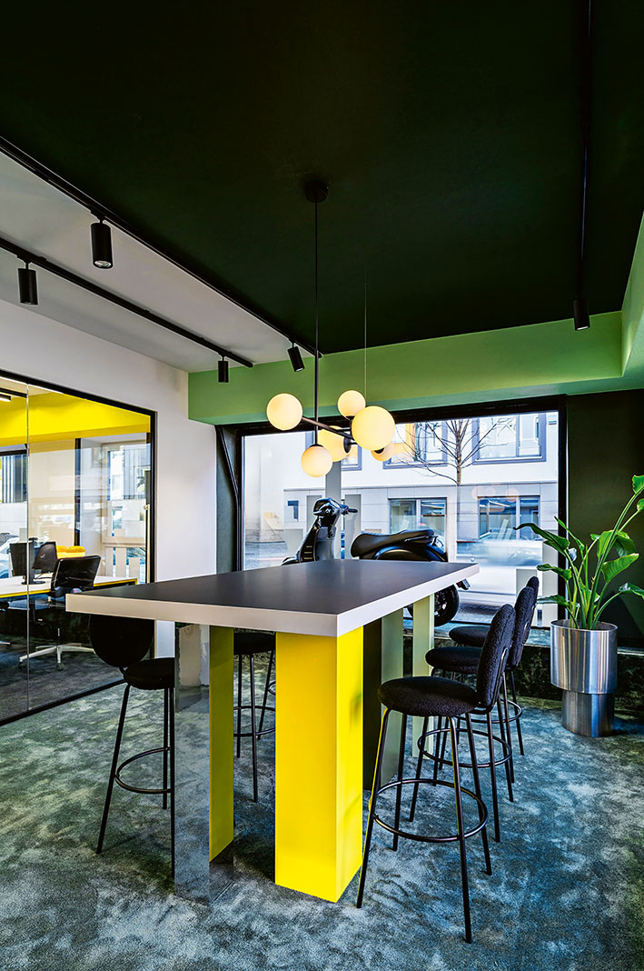
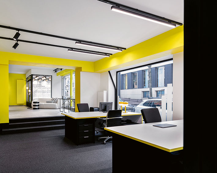
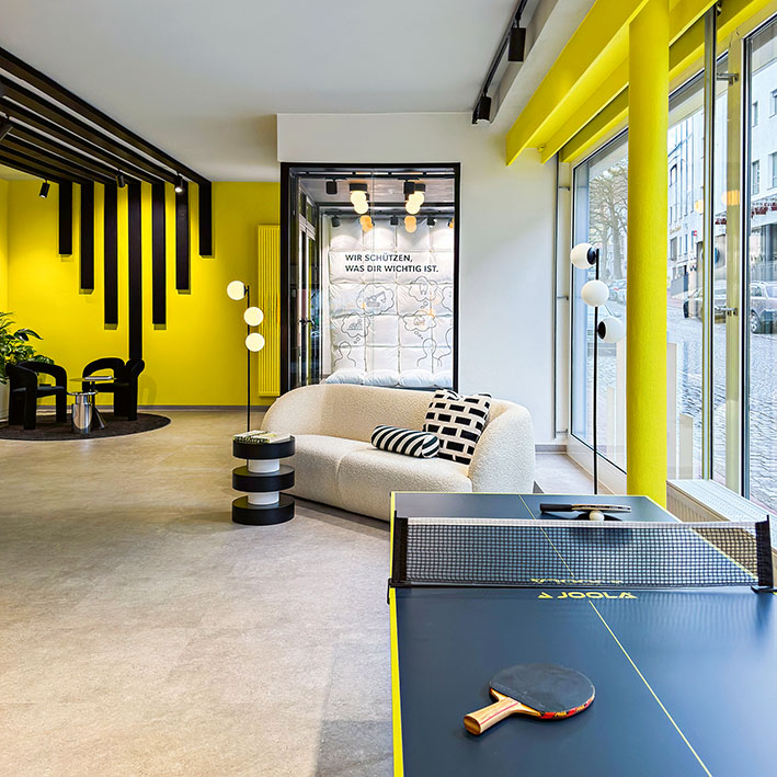
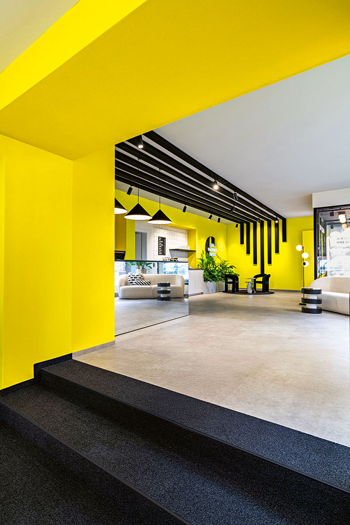
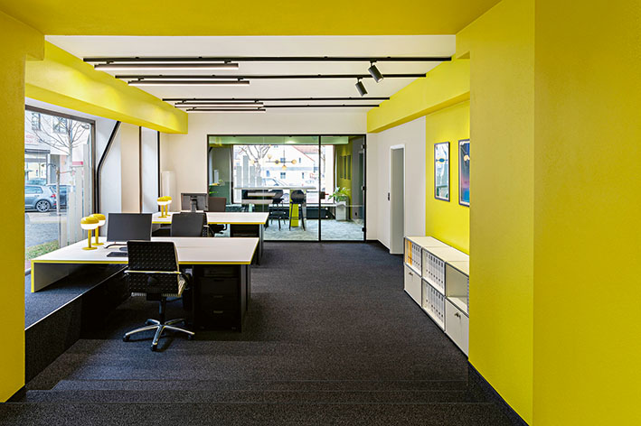
This is exactly what leads, in this case — a new office for an insurance company — to a formally striking presence, deliberately designed by both client and architects to achieve a high level of recognizability. In July 2025, Mecklenburgische Versicherung moved into Dachau’s historic town center. The new location was intended to clearly stand out visually and atmospherically from conventional work environments and to establish a “place with character.” Its ground-floor position, close to pedestrian traffic and featuring large window fronts, offered strong opportunities for outward communication, but also required a sophisticated spatial design. The space was meant to shine, attract attention, and spark curiosity — almost like a stage. It was not to convey rational office sobriety, but rather liveliness, openness, and attitude. The corporate colors — yellow, black, and white — were predefined and are consistently reflected throughout the interior design, from walls to furnishings and graphic elements. The message is powerful and positive. The success of this approach is evident in the reactions of customers and passersby, who appear to be readily drawn in. Particularly striking are the black acoustic strips that extend across ceilings and walls in combination with the company logo. Reflective surfaces, monochrome tiles, and bold color accents define the vocabulary of the workspace, where contrast is intentionally embraced. Organically shaped armchairs, a sofa, lush greenery, and textile details complement the design. A welcoming, residential feel meets an actively expressive office design within just 90 square meters. The design also integrates a dark-toned kitchen area and a restroom finished in vivid yellow tiles. In daily interaction with customers, the desired identity of the new space emerges through this cohesive aesthetic — one that strives to create an open and inviting atmosphere.
And if an interior architecture studio can achieve that—why not?